Logos and Logo Usage
College Logos, Seals and Marks
The Moreno Valley College graphic marks depict our College's focus on partnerships and the accessibility found here as exemplified by the supportive staff in a beautiful environment. Each logo mark conveys the College's unique identity.
Elements
The Wordmark
The Monogram
The Seal
Primary Logo
Interlocking Wordmark
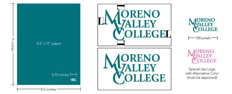
The Moreno Valley College wordmark is the primary college logo and should always be the first choice in any publication. The primary color for the logo is teal and it must always be reproduced in this color or in black and white.
Guidelines and Restrictions
The wordmark may be reproduced in black, white or MVC teal.
- Do not tint the logo to a different color.
- Do not deviate from approved colors.
- The logo may be used as a watermark with minimum 10% opacity and maximum 50% opacity.
This wordmark should never be smaller than 0.75 inches wide in print, and never smaller than 100 pixels wide in digital applications. The proportions of the MVC interlocking logo may never be altered.
- Do not stretch, skew or distort the logo such that the original proportions change.
- Do not rotate the logo.
Using clear space, or white space, ensures that the wordmark has space to breathe and allows clear recognition.
- The wordmark should have a minimum white-space around it, with the guide being the width of an "L" in "College." No other text, graphics or elements should appear in this space.
- Under no circumstances should the edge of the wordmark touch the edge of a composition or another branding element.
The wordmark may be reproduced in other colors on special occasions, as approved by Strategic Communications.
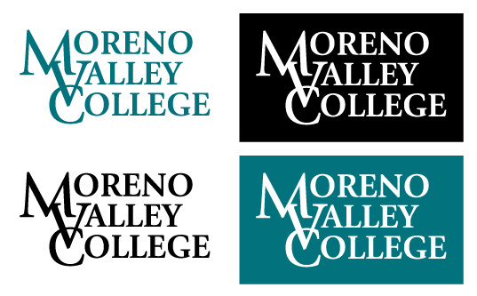
Secondary Marks
Horizontal Wordmark
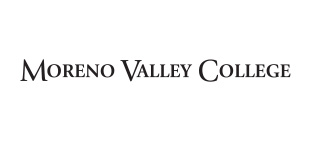
The horizontal version of the wordmark is the secondary MVC logo and may be used only when nothing other than a horizontal solution is feasible. Similar restrictions apply to the horizontal wordmark as to the primary wordmark, except for:
- Minimum width: 150 pixels or 1.5 inches
Co-Brand
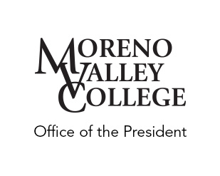
Co-branding means using the primary Moreno Valley College logo in conjunction with the name of a department or program. At request, a co-branded logo will be created for departments and programs. No other logo will be accepted.
- Required font: Avenir
- Orientation: Vertical, with the wordmark on top and the name of the department below; or horizontal, with the wordmark to the left, and left-aligned text to the right, separated by a thin line.

Monogram
The wordmark may be abbreviated into MVC's monogram when space or ability to convey the full logo is impossible due to size constraints. Examples of where this using this symbol is appropriate is on building signage (such as the lit sign on the side of the Student Academic Services building) or the website favicon symbol. The monogram is special case only and may only be used with permission. Using this symbol on flyers or marketing collateral is unacceptable.
Formal Wordmark with Seal (Vertical)
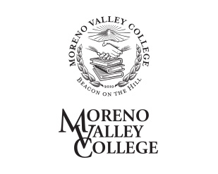
This mark is made up of two components: the wordmark and the official college seal. The formal mark is for official and ceremonial purposes only. Usage must be approved on a case by case basis. Contact the Office of Strategic Communications and Relations for permission.
The components of this logo may never be rearranged, altered or reproduced, unless prior approval is gained by College administration. This mark is being phased out of general usage.
Formal Wordmark with Seal (Horizontal)
The horizontal version of the wordmark with seal may be used only when nothing other than a horizontal solution is feasible. This is for formal and ceremonial use only. All media displaying this mark must be approved. This mark is being phased out of general usage.
Beacon on the Hill College Seal
Restrictions
- Approved Colors: The MVC seal can only be reproduced in the official Moreno Valley College teal or black. The seal can be reversed when printed on a dark color background.
- Foil Stamping: It can be foil stamped in silver, gold, or bronze. The minimum height when foil stamping is one-half inch.
- Watermark: The seal can be printed as a watermark behind official Moreno Valley College documents such as transcripts. When screening the seal for a watermark, it cannot be screened back further than 90% of official MVC teal or black.
- Minimum Size: The seal should never be smaller than 0.75 inches wide in print, and never smaller than 100 pixels wide in digital applications.
- White space: The seal should never be closer to the edge of a composition than .25 inches or 100 pixels, or closer to another graphic element or logo than the distance of the width of the "2010" accreditation year.
- Special Usage: The seal is to be used only on official College documents. It may never be used for marketing except for official and ceremonial events. Instead, use the wordmark.
Athletics and Mascot Mark
The MVC athletics and school spirit mark is made up of a mountain lion stepping out of an oval background. The primary version includes the text Moreno Valley College Mountain Lions, though the mascot without text is also available. MVC's mascot mark may only be reproduced or embroidered in the College's signature teal or black. It may not be reversed. The MVC mascot may only be reproduced on solid color backgrounds.
This mark is intended for athletics, student activities, and other uses to promote school spirit. It is not appropriate for academic or business use.
Ben Clark Training Center
The Ben Clark Public Safety Training Center (BCTC), located 11 miles from the main Moreno Valley College campus, is one of the largest public safety training centers in Southern California. Ben Clark Training Center is comprised of a partnership with MVC, Riverside County Sheriff's Department, California Department of Forestry & Fire Protection, Riverside County Fire Department, California Highway Patrol, and Riverside County Probation Department.
The Ben Clark Training Center, as an education center, utilizes a challenge coin logo that demonstrates the Center's commitment to public safety and the partnership-based programs available.
Service and Program Logos
iMAKE Innovation Center
MVC Promise Initiative
State or Federal Programs
These programs have logos set at the state or federal level.
- CalWORKs
- NextUp
- Puente
- TRIO
- Umoja Community
Usage
Moreno Valley College logos are the strongest visual representation of our brand identity. While the College aims to support a responsive brand that adjusts to the needs and expectations of our students and community, which sometimes includes expanding our branding to recognize or highlight exceptional and impactful programs and services, the college identity remains paramount. All logos and marks, as well as the Moreno Valley College name, are property of the College and the Riverside Community College District. They are subject to and governed by usability guidelines, and any new marks are created by designated personnel only. Unauthorized, custom, or altered logos, or any use of the College name, that claims association with Moreno Valley College are prohibited. The College has the right to request the immediate suspension of any unapproved logos and marks using the Moreno Valley College name or identifying brand elements.
Requesting Files
The logo is available in a variety of electronic file formats, each intended for a particular use depending on the media for which it will be reproduced. Selecting the correct file format will ensure that the logo is reproduced in the appropriate manner and will maintain the MVC brand identity. Logo requests may be sent to the college webmaster.
- EPS - vector files are for use in professional printing applications; it prints in the highest resolution, it is scalable, and has a defined color model such as CMYK or spot color.
- JPG - are bitmap images with RGB color. JPG versions of the MVC logos have opaque backgrounds in online and screen applications such as email and PowerPoint where the background is a solid white.
- PNG - are bitmap images with RGB color. PNG versions of the MVC logos have transparent backgrounds and are the best options for PowerPoint or email or in applications where the background is not a solid white.
Logo on Colorful Backgrounds
When the MVC logo is used on color backgrounds, typically it should be printed in white or black. The MVC logo should never be used on a multi-colored background unless the background is screened with a solid color to increase contrast. While a drop shadow or border are alternative options, a solid color between 25% and 75% opacity is preferred. Consult with the Office of External Relations and Strategic Communications for proper usage on color backgrounds.